
iDRIVEDIRECT | ~5 min read TIME
Creating a smoother, more trustworthy experience for vehicle owners online.
I led the full brand and UI/UX refresh for iDriveDirect.ie, an Irish automotive platform connecting drivers with trusted local car experts. I redefined the brand identity to signal clarity, reliability, and professionalism. From logo and typography to website layout and interaction design, every element was rebuilt to create a more intuitive, approachable, and confidence-inspiring experience for vehicle owners navigating services, repairs, or listings.
PROBLEM
SOLUTION
MY ROLE
Discovering
Evaluating brand perception.
Visually, iDriveDirect lacked a clear identity and came across as generic and impersonal. This weakened user confidence and failed to position the platform as a trusted, expert-led service.

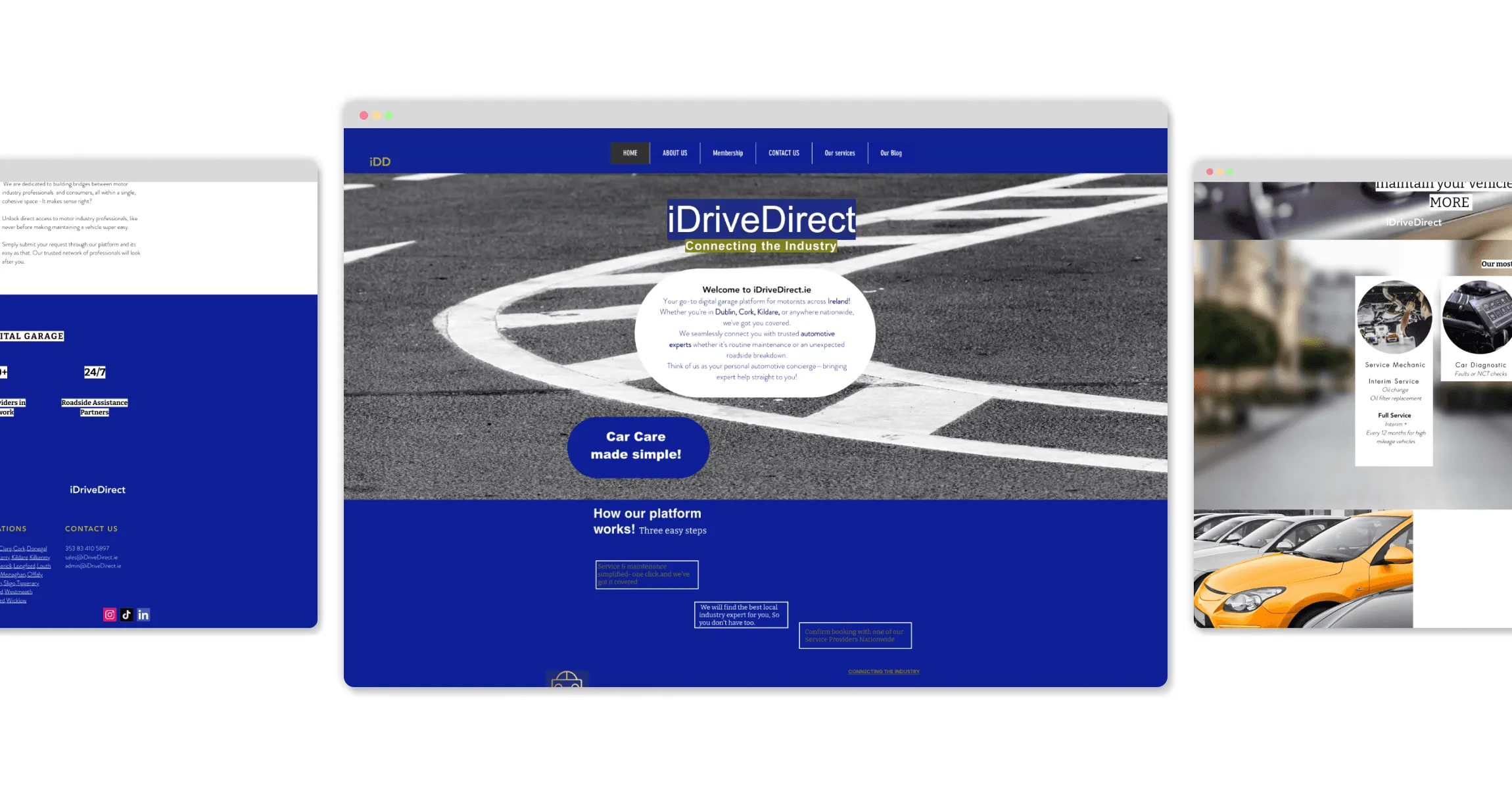
Auditing the current platform.
The original iDriveDirect.ie site felt outdated and lacked the visual clarity needed to build trust with users seeking local auto services. I mapped the full user flow and identified key friction points, including buried actions like booking and location filtering, unclear hierarchy, and weak mobile usability.
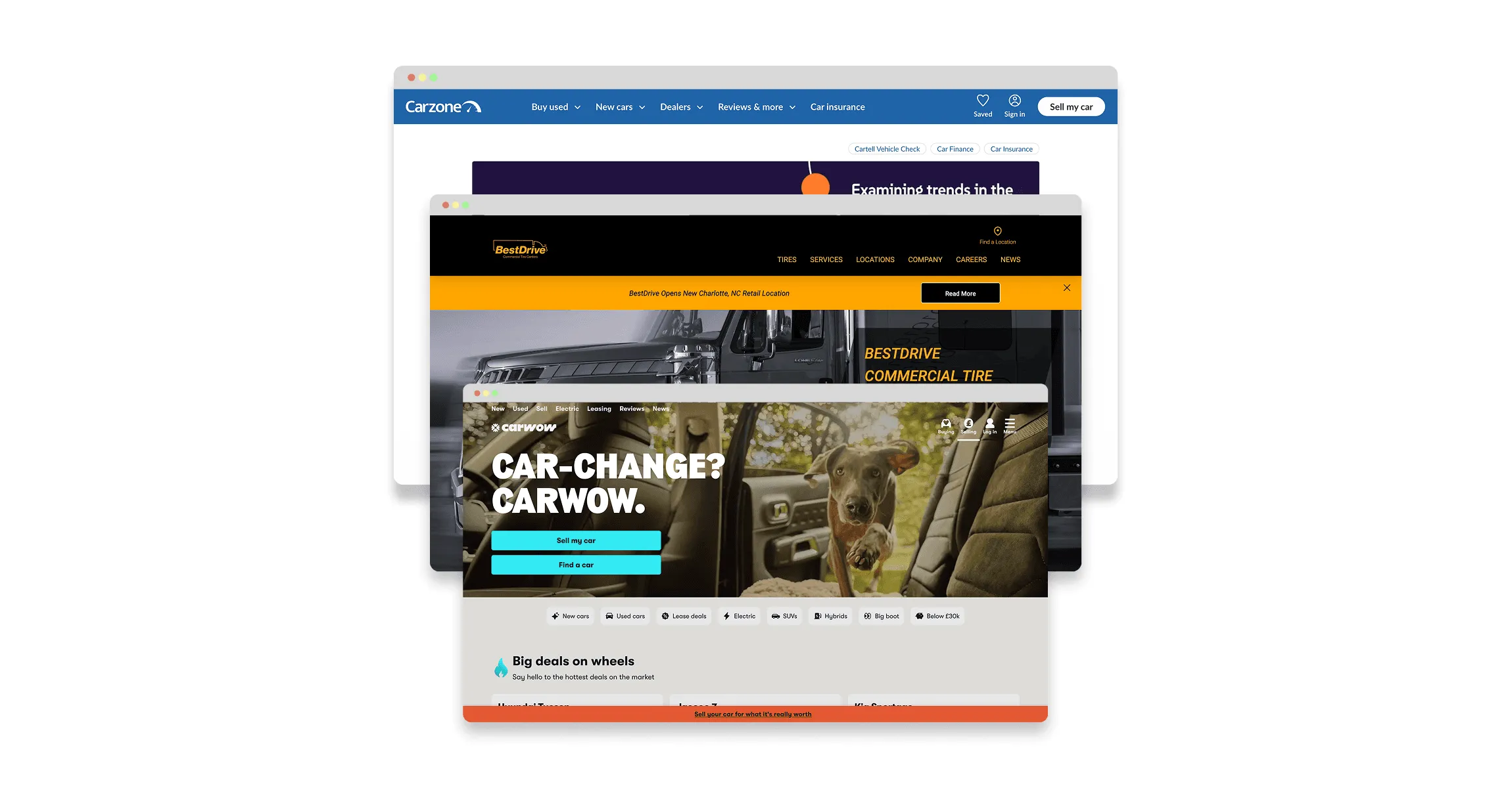
Researching competitors to uncover opportunities.
I benchmarked top Irish and UK automotive platforms to uncover what drives user trust and ease of navigation. These insights shaped a stronger brand position and guided UX decisions that made it easier for drivers to find and connect with local experts.
Defining
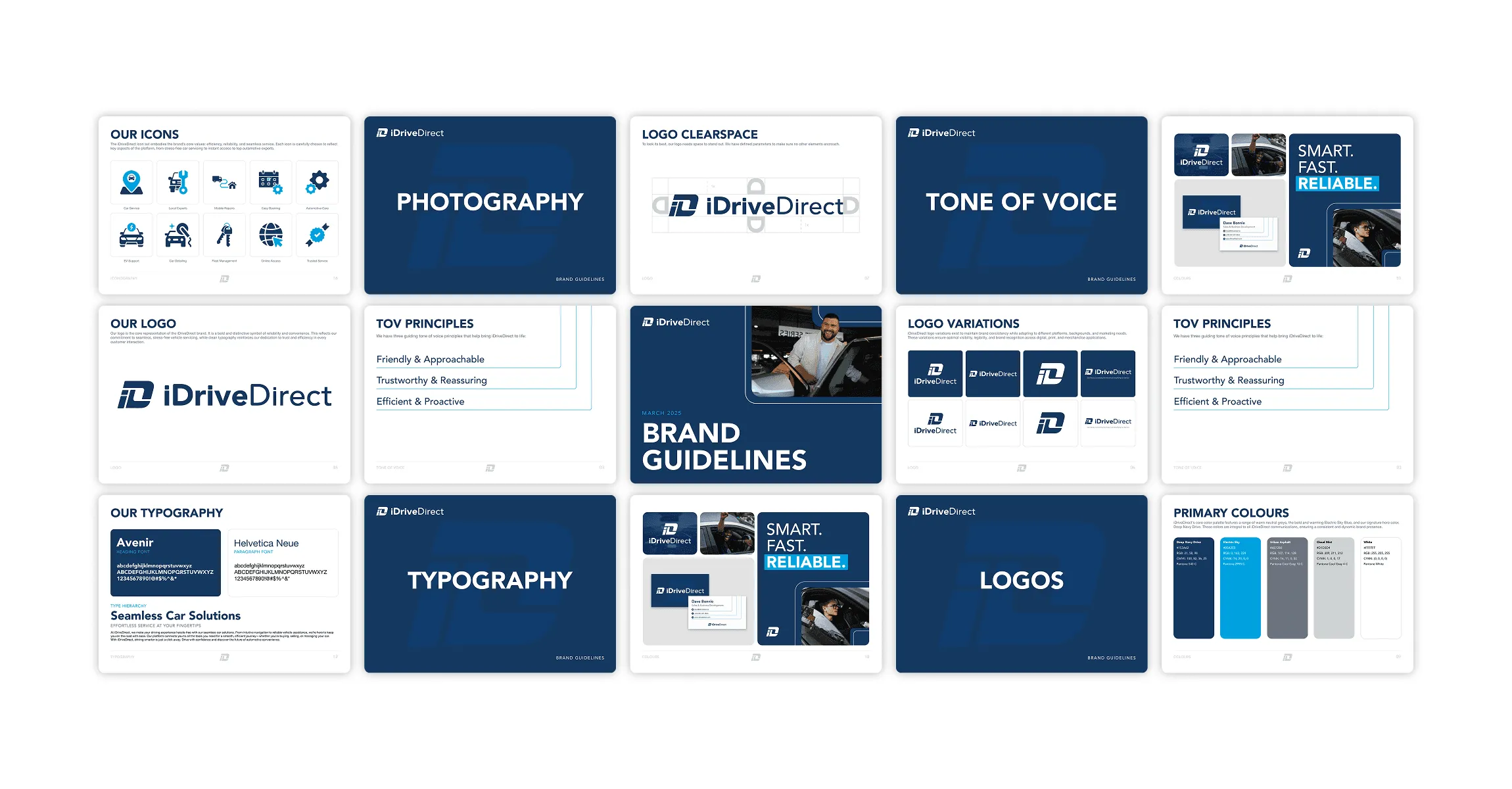
Modernising the iDriveDirect logo.
The original iDriveDirect logo felt generic and lacked clarity. I redesigned the mark to feel more modern and trustworthy, improving legibility, simplifying the symbol, and aligning it with the brand’s updated tone of expertise and approachability.
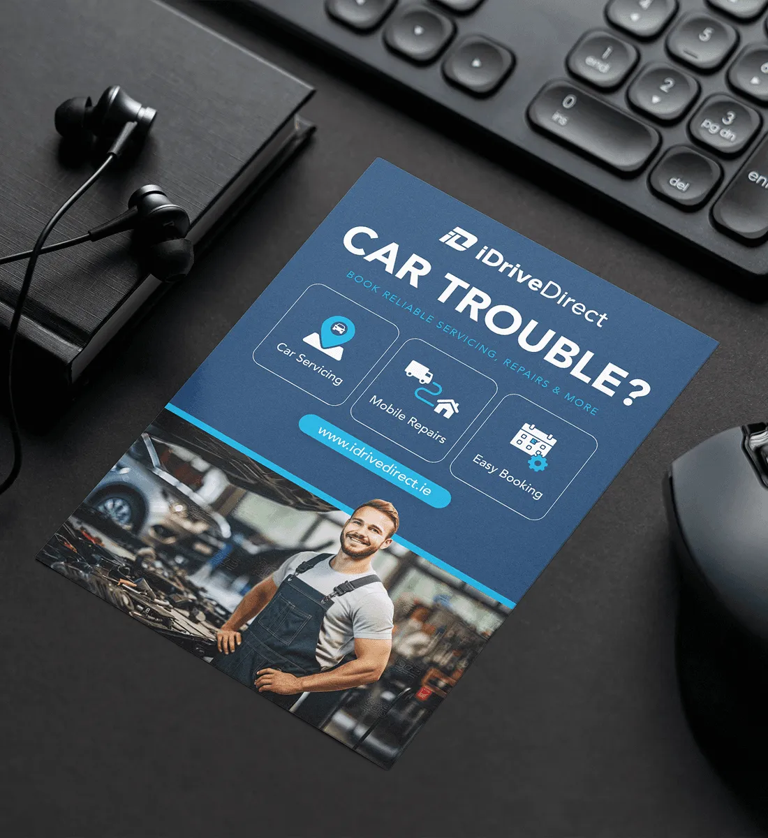
Building a cohesive visual identity.
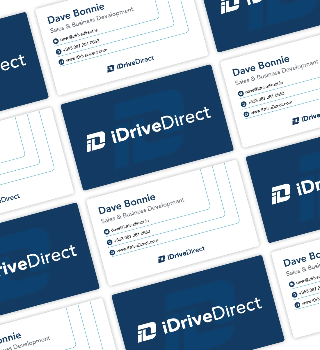
I redesigned the logo to feel clear, modern, and trustworthy, using clean geometry and subtle automotive cues. This foundation extended into a suite of print materials including business cards, flyers, and service sheets, ensuring consistency across digital and physical touchpoints.

Mapping the ideal user journey.
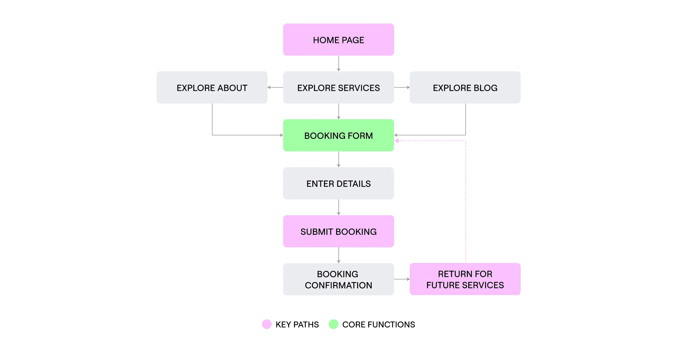
I defined a streamlined booking flow that prioritized clarity and ease, guiding users from service discovery to confirmation in just a few steps. Key paths and core functions were mapped to reduce friction and encourage repeat engagement..
Developing
Translating insights into interface design.
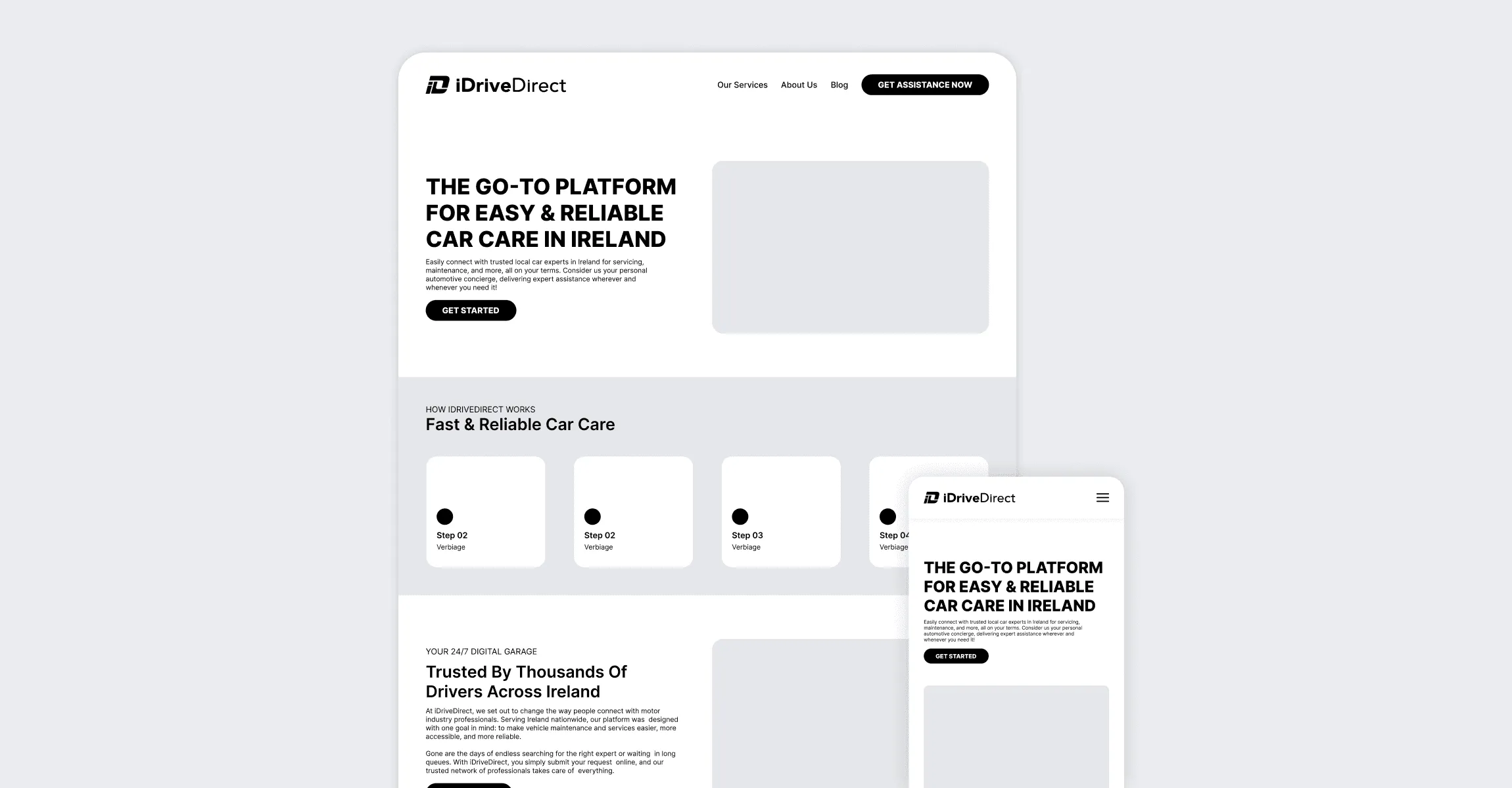
With clear goals established, I began designing high-fidelity wireframes focused on trust, usability, and simplicity. Each layout was built to reduce cognitive load, guide users toward booking, and adapt seamlessly across devices.
Creating reusable, trust-led UI blocks.
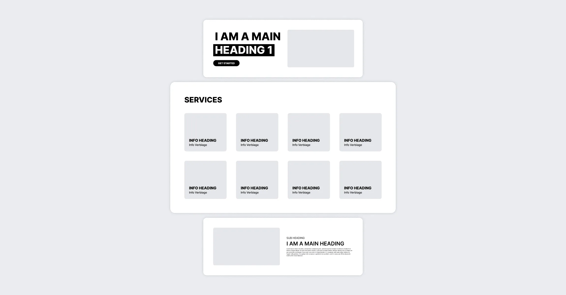
Modular UI patterns designed for consistency and clarity, including a reusable service card grid, hero layout with CTA, and flexible content blocks used across iDriveDirect’s core pages. These patterns support faster development and a more intuitive user experience.
Delivering
From wireframes to final build.
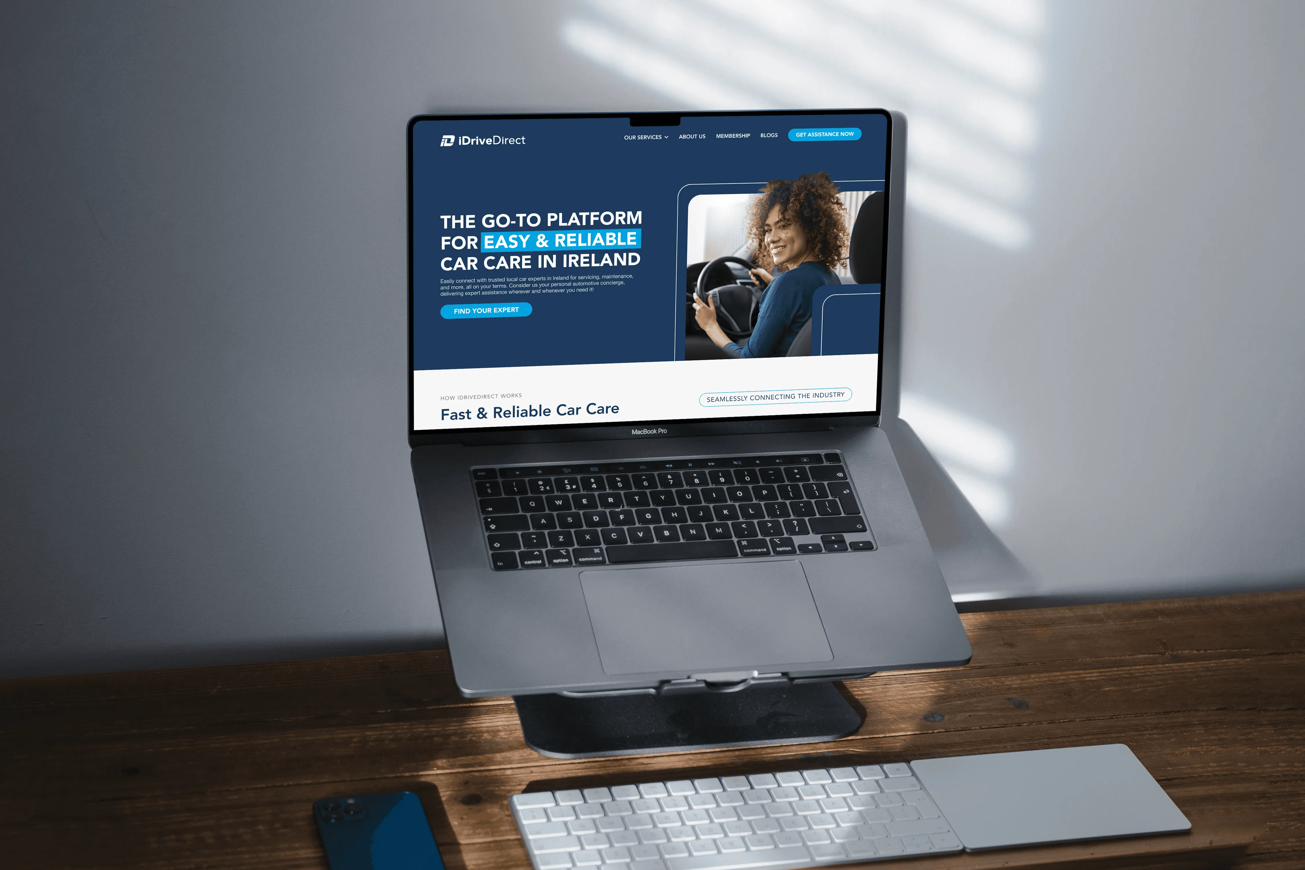
With the wireframes as a foundation, I translated the designs into a responsive, user-friendly website. Every page was built to guide users clearly through the booking flow, reinforce trust through consistent branding, and perform smoothly across devices.
A smarter way to book.
The previous booking form lacked visual clarity and created friction for users. By stripping back unnecessary layers and focusing on a simplified input flow, the new system improves accessibility, builds trust, and shortens the path to conversion.
