GALAXY DISPLAYS | ~5 min read TIME
A cleaner, faster experience for trade show resellers.
I led the full e-commerce redesign for Galaxy Displays, a trade show supplier catering to resellers across North America. The outdated site lacked structure, mobile performance, and modern conversion practices. I overhauled the entire shopping experience by redesigning product pages, categories, and the full buying flow to simplify decision-making and improve CRO.
PROBLEM
SOLUTION
MY ROLE
Discovering
Revealing performance breakdowns.
A Lighthouse audit exposed major speed and usability issues, with a performance score of 42. Long load times, broken layout shifts, and heavy assets led to a frustrating experience for users, especially on mobile. These issues made it harder to browse, compare, and complete purchases with confidence.

Identifying navigation pain points.
I audited the navigation and saw users struggle to move through the site. Overcrowded dropdowns and unclear labels made it hard to browse by size or style, leading to confusion, slower decisions, and early exits.
Friction in the upload process.
Uploading graphics is essential for resellers, but the option was hard to find and lacked guidance. This added friction at a high-intent moment. Improving its visibility and clarity could reduce hesitation and support stronger conversions.
Outdated product experience.
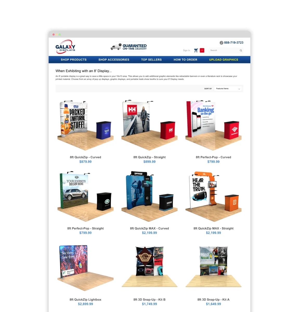
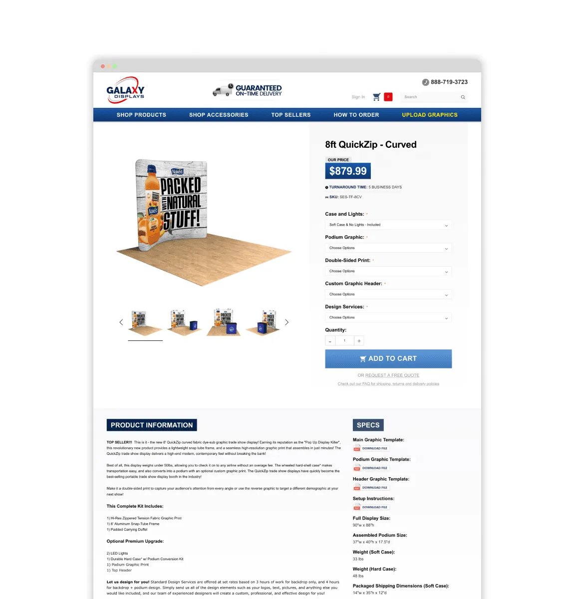
Cluttered product pages and unfiltered categories made it hard to compare options. Dense text, small thumbnails, and no clear value props slowed decisions and hurt conversions.
Defining
Uncovering a clearer way to shop.
User research surfaced navigational friction and decision fatigue. I proposed “Shop by Style” and “Shop by Size” as top-level navigation patterns - clear mental models that aligned with user intent and simplified product discovery.

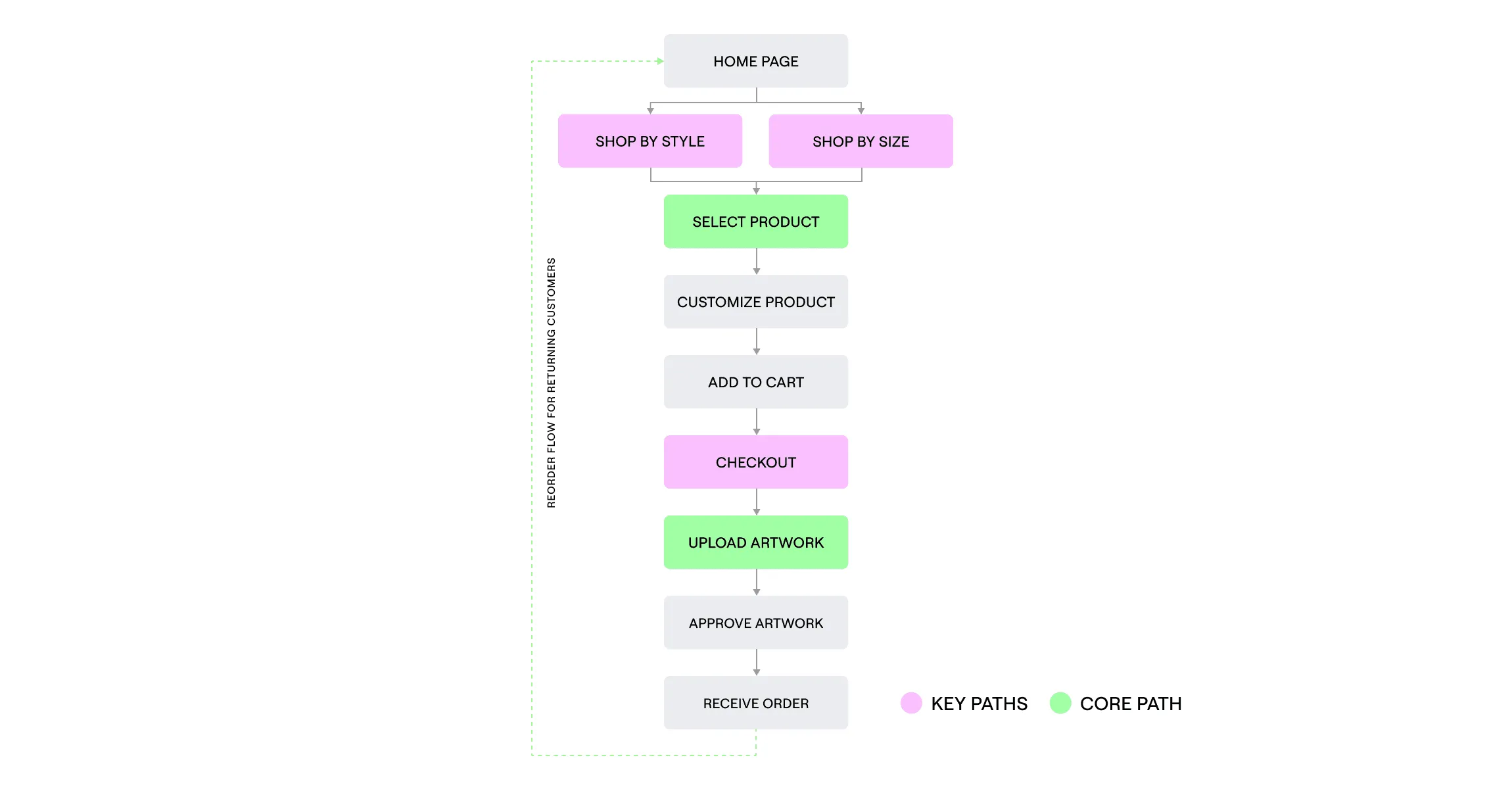
Outlining the optimized buying flow.
To improve clarity and reduce friction, I mapped a more streamlined buying journey with fewer steps and clearer decision points. The updated flow guides users from homepage to checkout in a direct, intuitive path, minimizing distractions and supporting faster repeat purchases.
Developing
Structuring a clearer homepage.
I redesigned the layout to prioritize clarity and hierarchy. The wireframes guided users to key categories faster, using simplified sections and clear entry points to boost engagement from the first click.
Wireframing improved navigation.
I restructured the navigation to better match how resellers browse, by booth style and size. This replaced outdated, vague categories with more intuitive paths, helping users reach the right products faster and compare options more confidently.
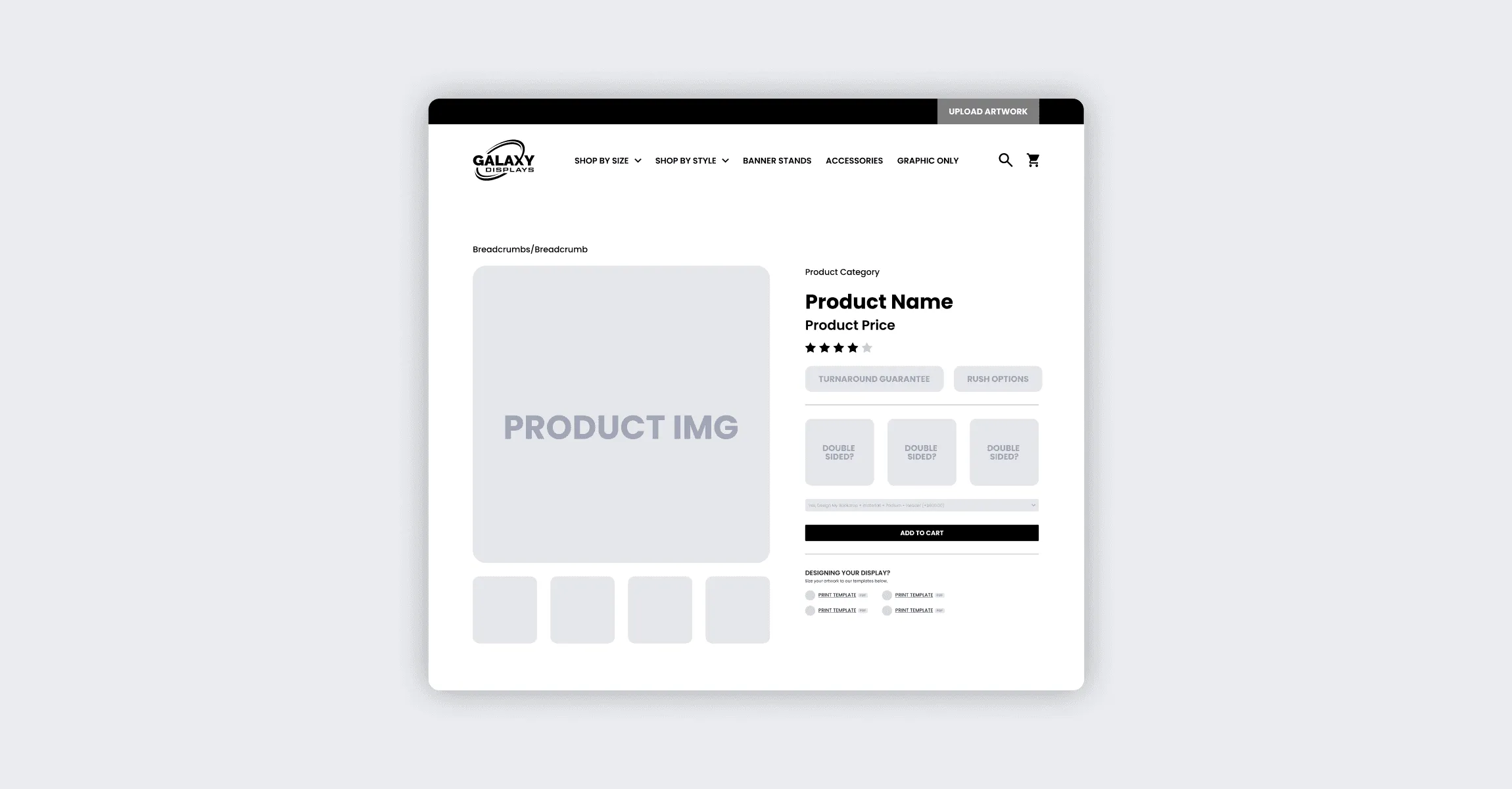
Optimising the product page for decision-making.
The product page wireframes focused on improving scanability, option selection, and flow to checkout. I removed visual clutter, emphasized pricing and options, and streamlined the layout to guide users smoothly to checkout.
Delivering
From wireframes to polished interface.
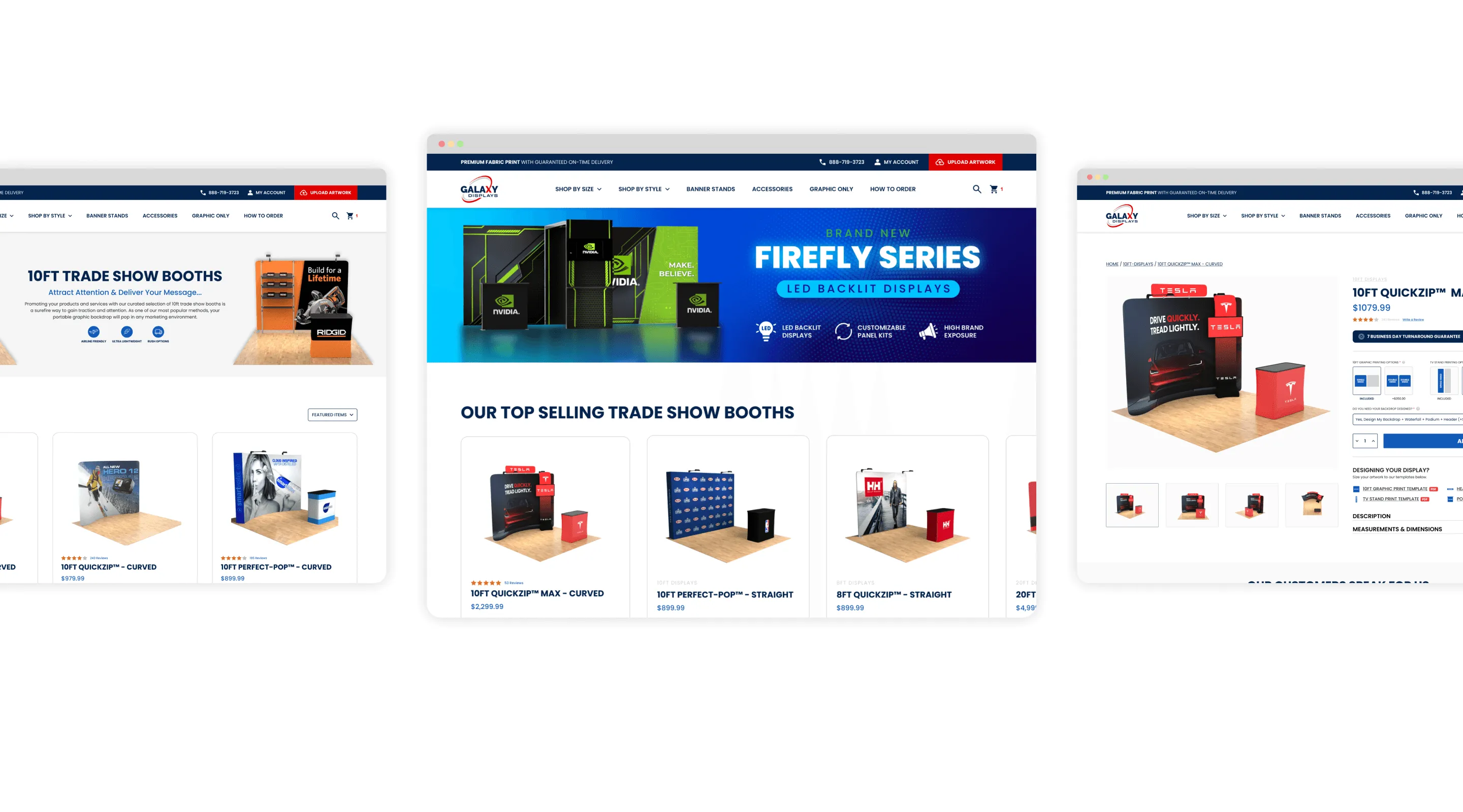
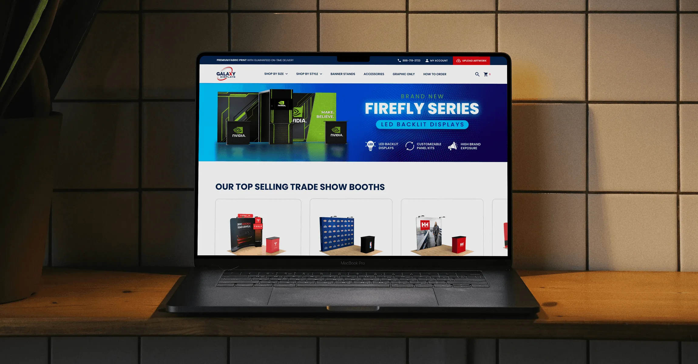
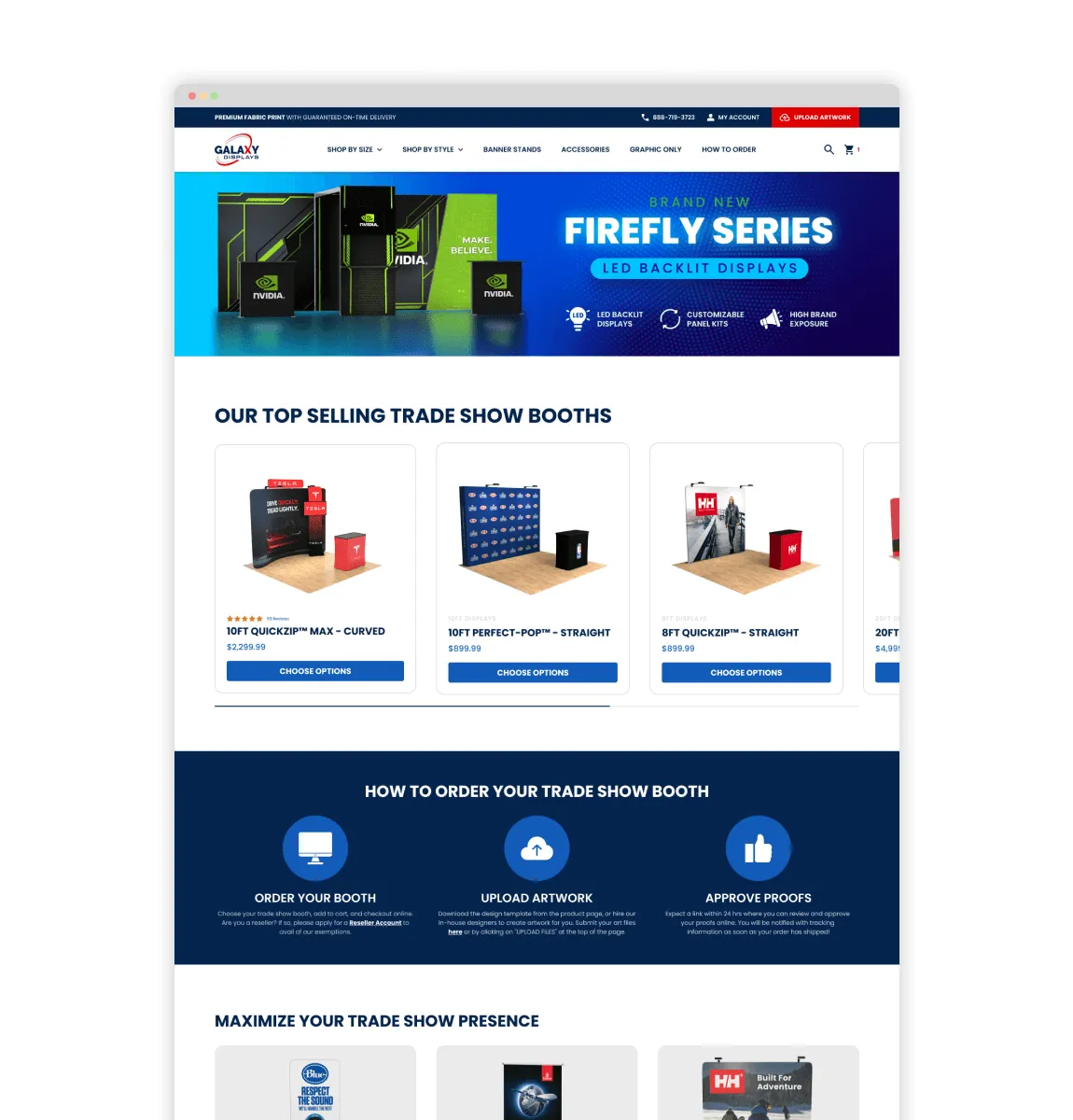
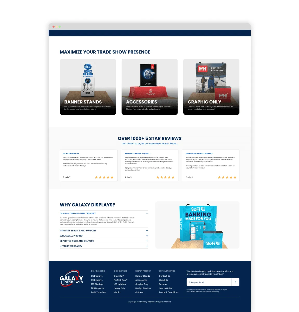
Building on the wireframes, I crafted a clean, conversion-optimized interface. The updated homepage prioritizes product visibility, simplifies entry points, and reinforces trust through visual clarity and strong hierarchy.
Product pages built for action.
Each product page was redesigned to support quicker decisions. Customization options are now easier to scan, pricing is clear, and templates are accessible upfront. Every element is structured to reduce friction and improve conversion.
Smarter navigation, smoother shopping.
The final experience made it easier for users to browse by booth style or size, compare products, and move through the purchase flow with confidence. Improved navigation and layout clarity directly supported quicker decisions and a smoother buying journey.