roundhouse cafe | ~2 min read TIME
Forging a industrial visual identity for a community staple.
Nestled in a restored 1888 train depot converted to a community centre in downtown Vancouver BC, the café called for an identity that honoured its industrial roots while feeling warm and current. I designed a vintage-inspired logo with subtle nods to locomotive curves, anchoring a cohesive system built on deep blue and warm cream tones, blending grit with comfort, heritage with polish.
The Brief
The Concept
The Identity
Logo
Researching & gathering inspiration.
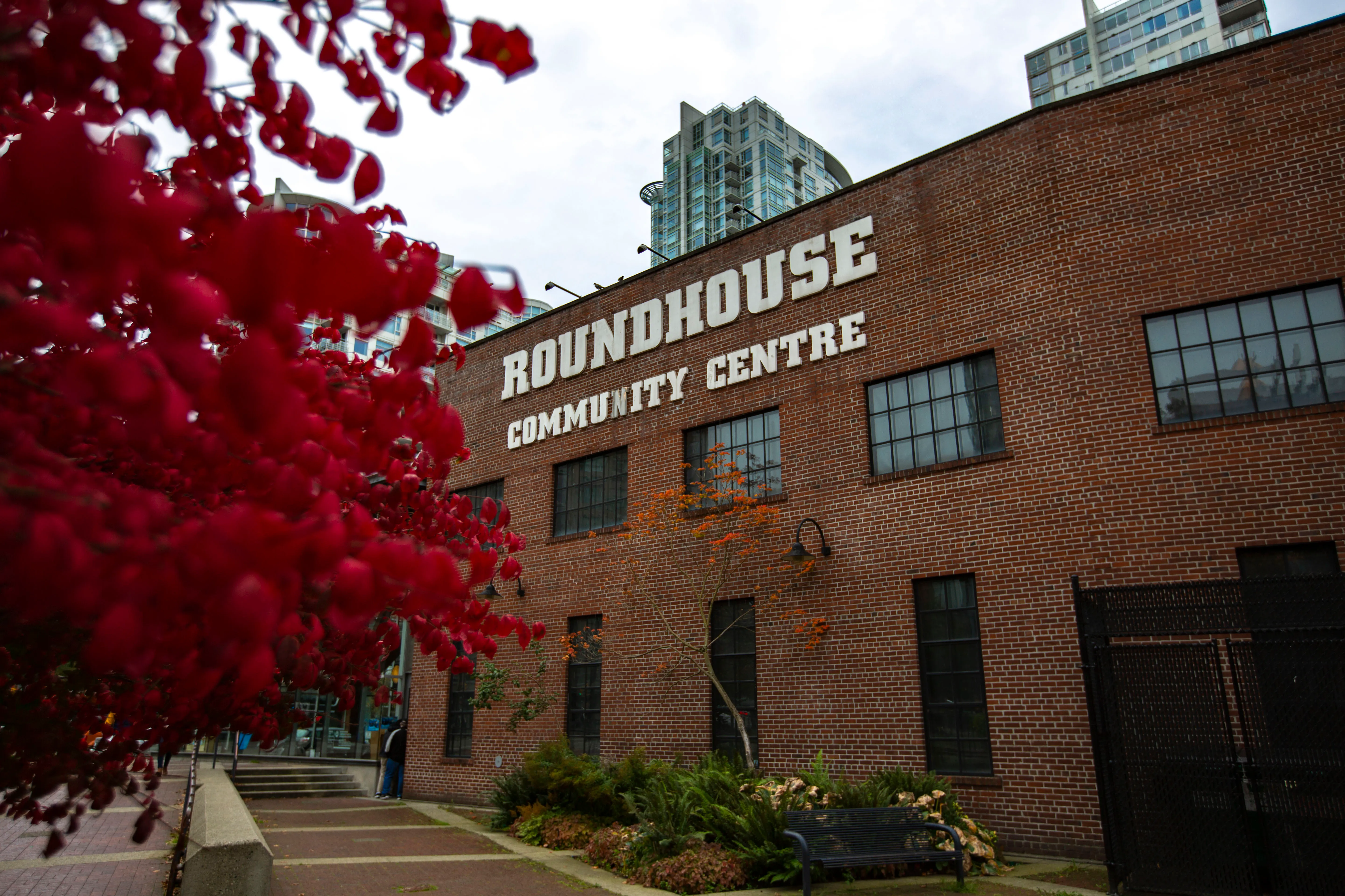
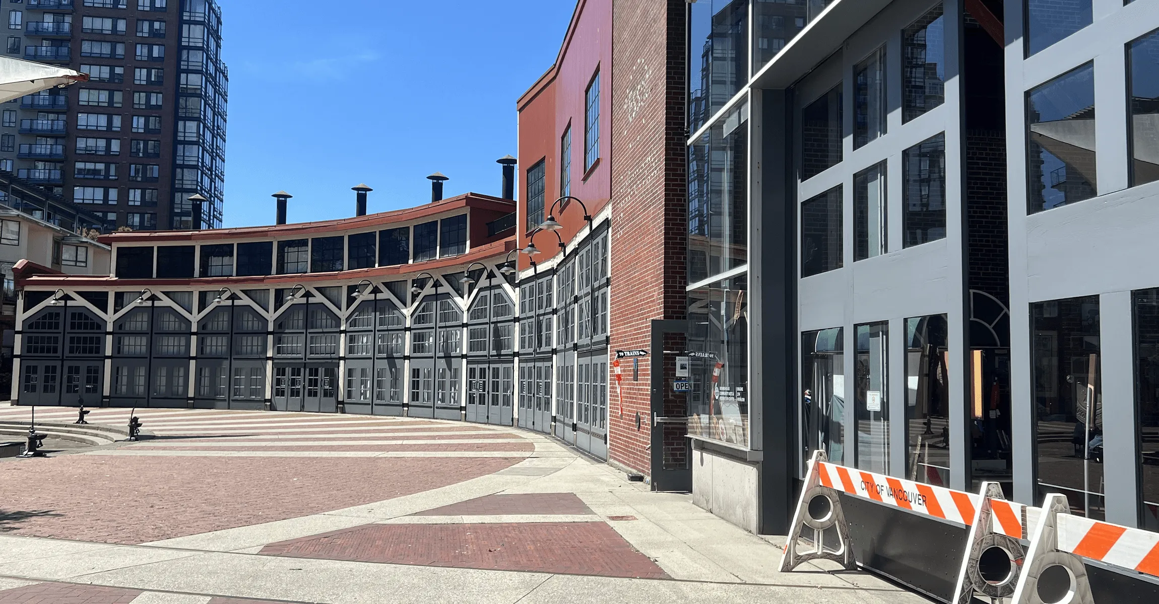
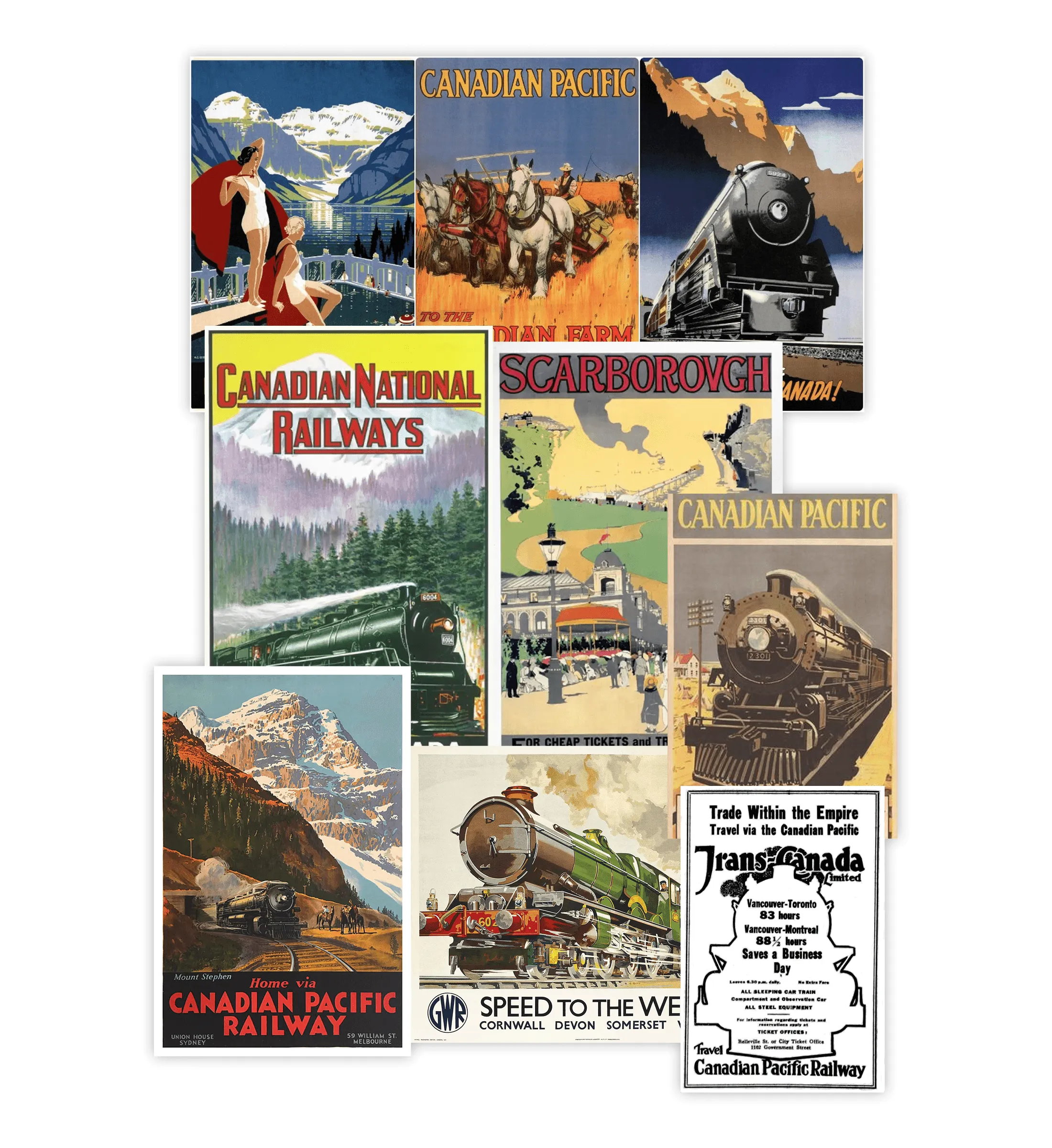
I visited the 1888 roundhouse to capture its atmosphere and architectural details up close. I also gathered & studied vintage railway posters and industrial signage online to draw inspiration from to their bold, condensed typography and structured, no-nonsense layouts.
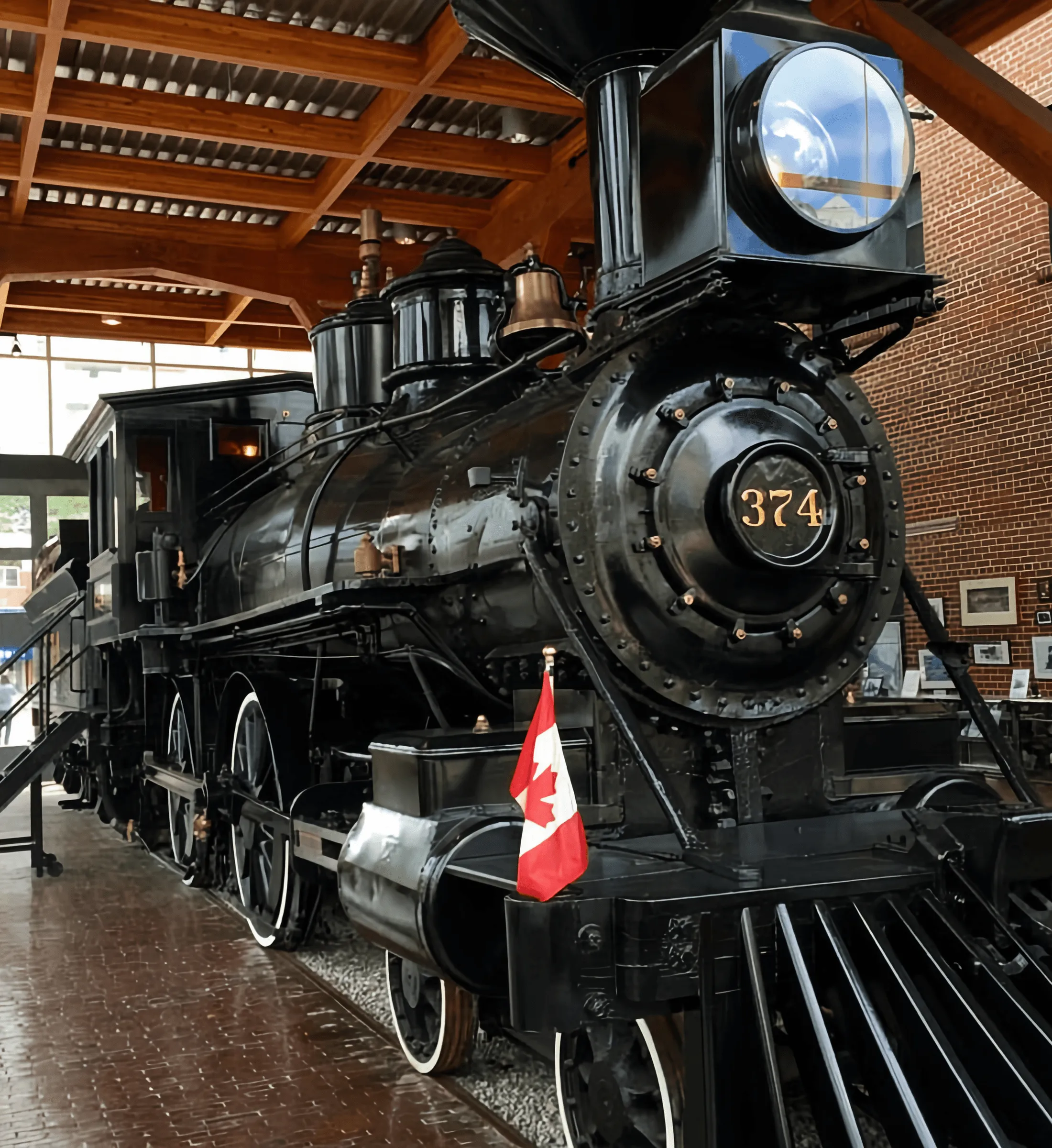
Rooted in steam and steel.
Inspired by the roundhouse’s curved architecture and the bold typographic language of railway posters, the logo balances symmetry with strength. Its condensed letterforms reflect industrial signage, while its circular form anchors the brand in its historic 1888 home - confident, timeless, and built to last.
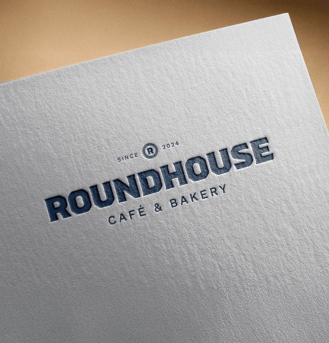
Marketing Collateral
Bringing the brand to life.
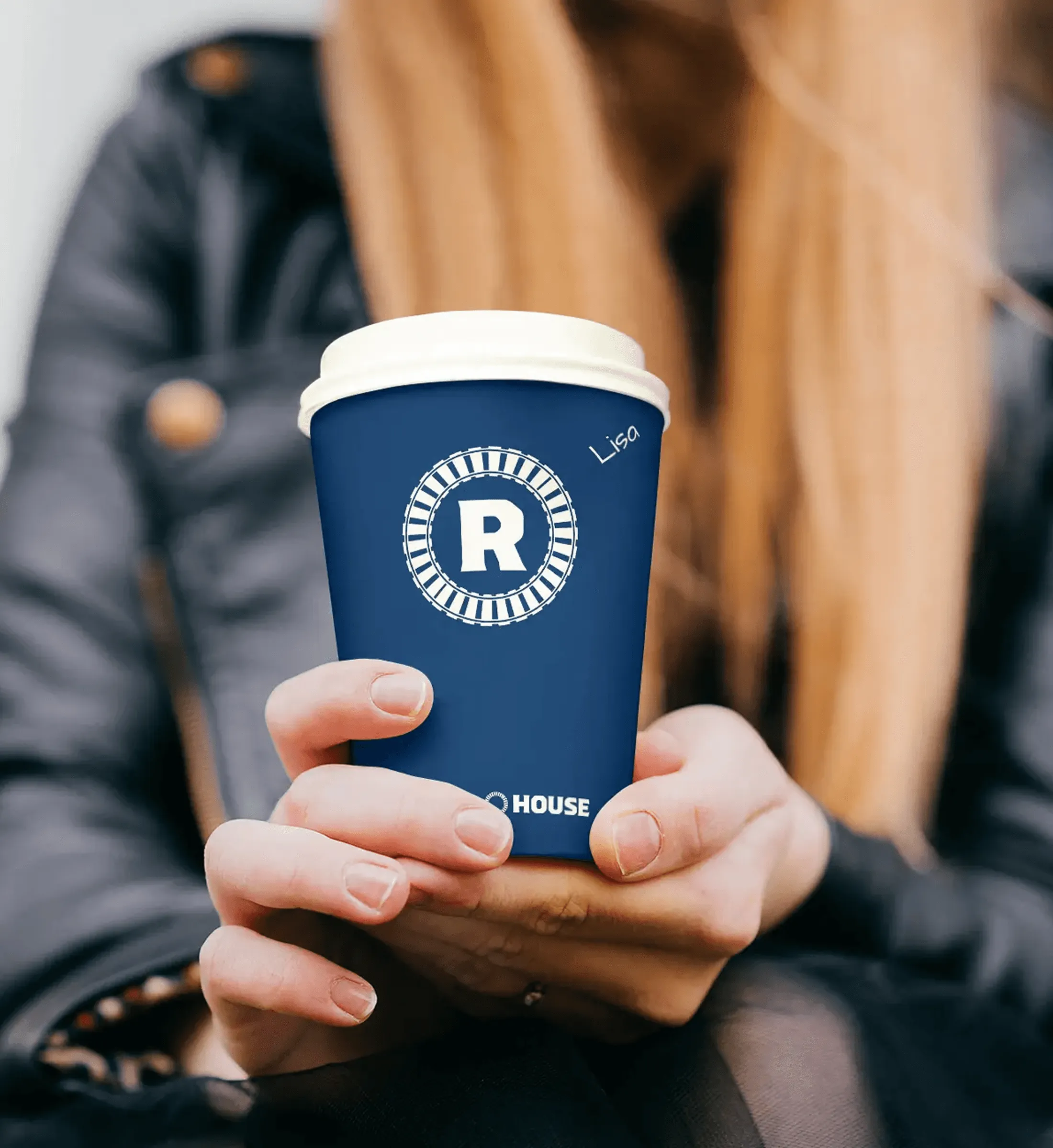
Menus, cups, packaging, and signage were designed to make the brand feel cohesive at every customer touchpoint. The bold logo, deep blue tones, and industrial type treatments carry through with confidence, giving Roundhouse Cafe a strong, ownable presence in both print and physical space.
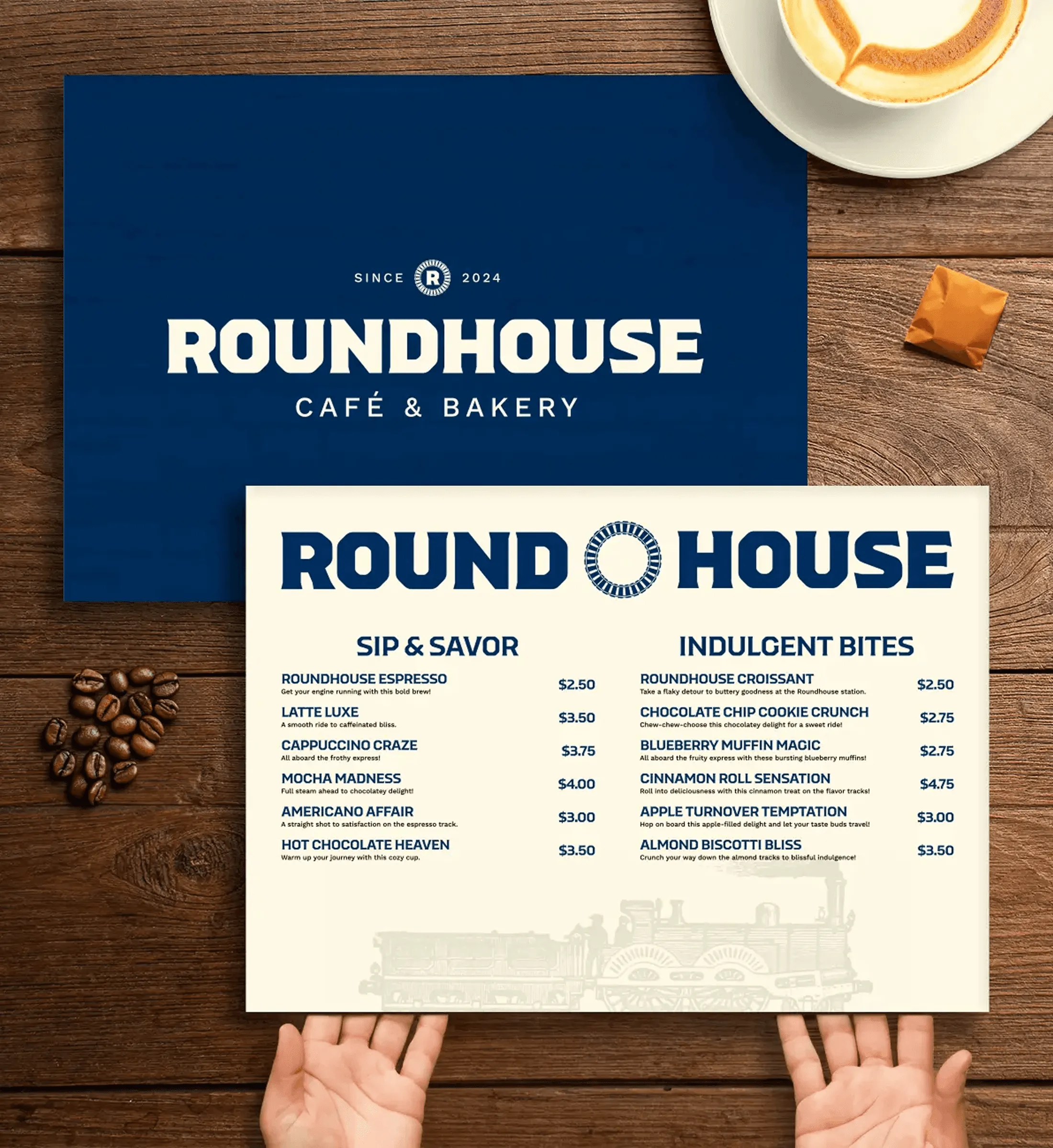
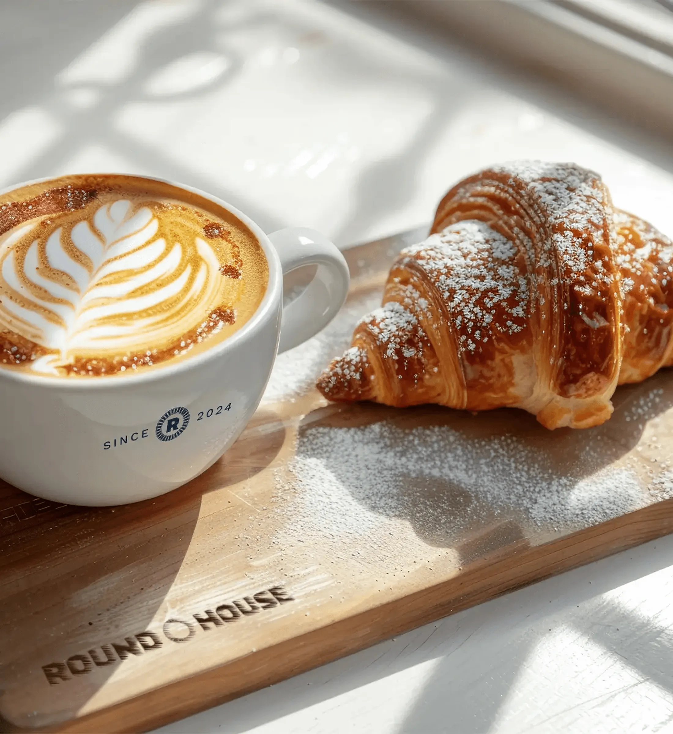
Extending the brand system.
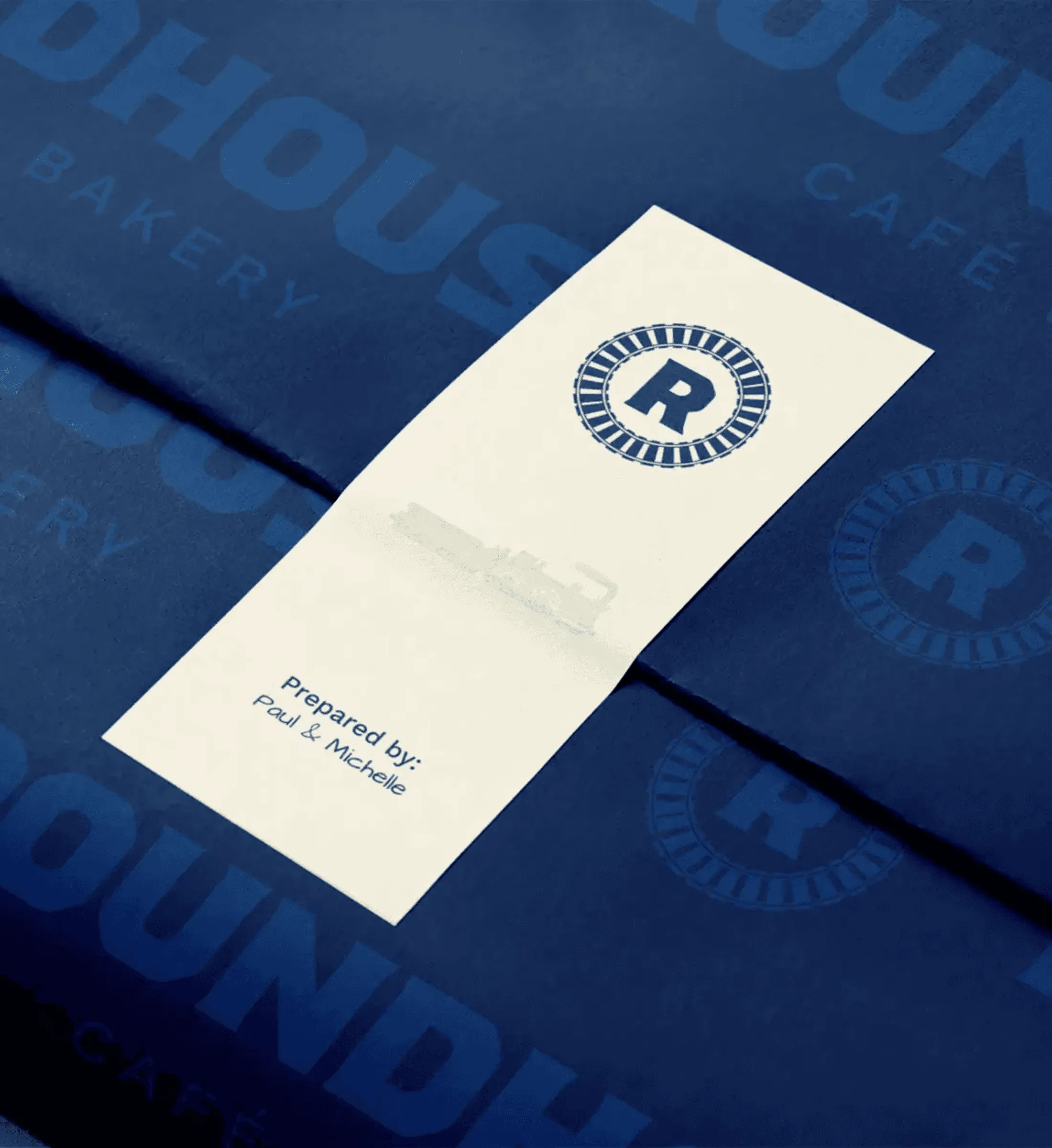
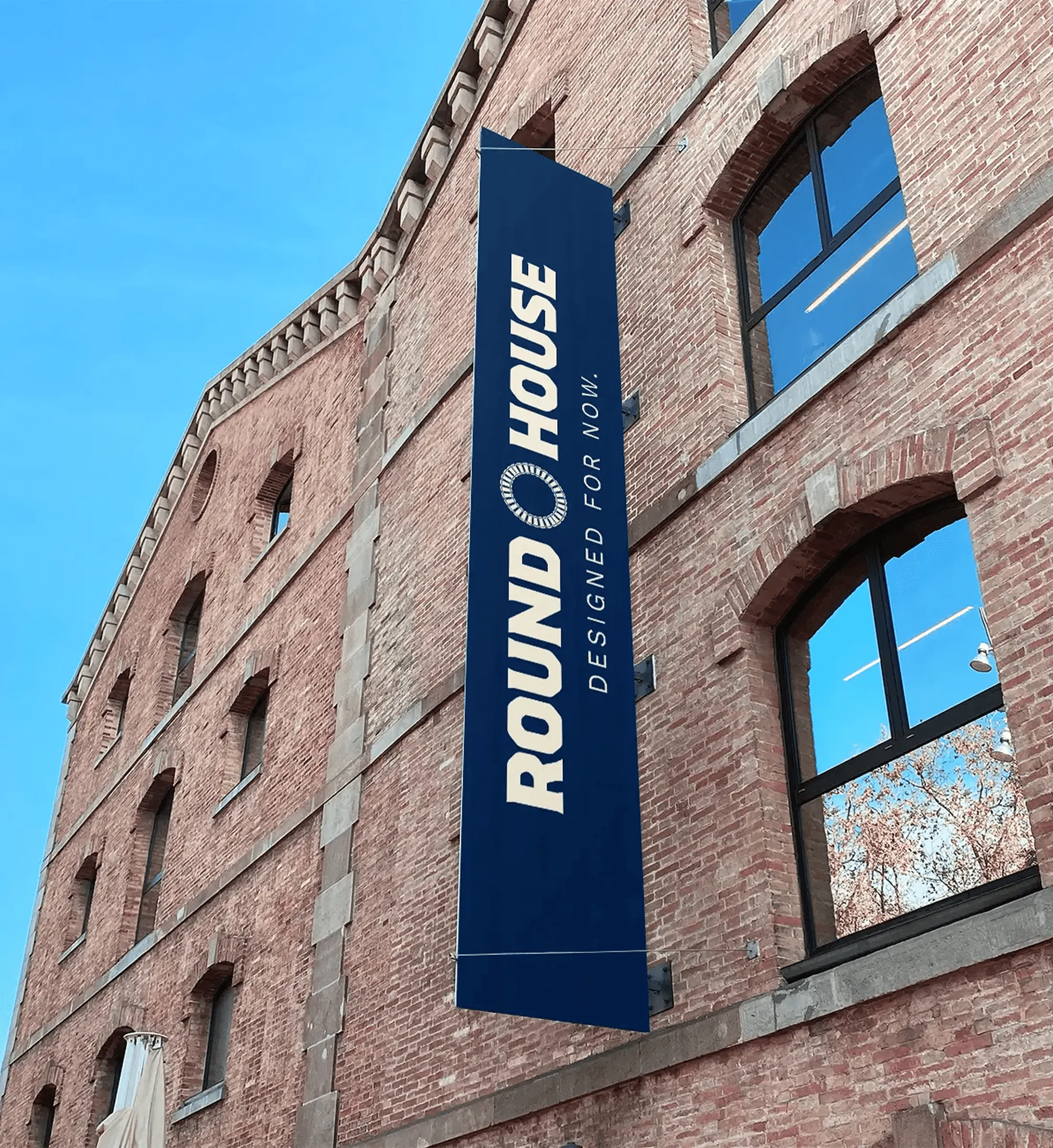
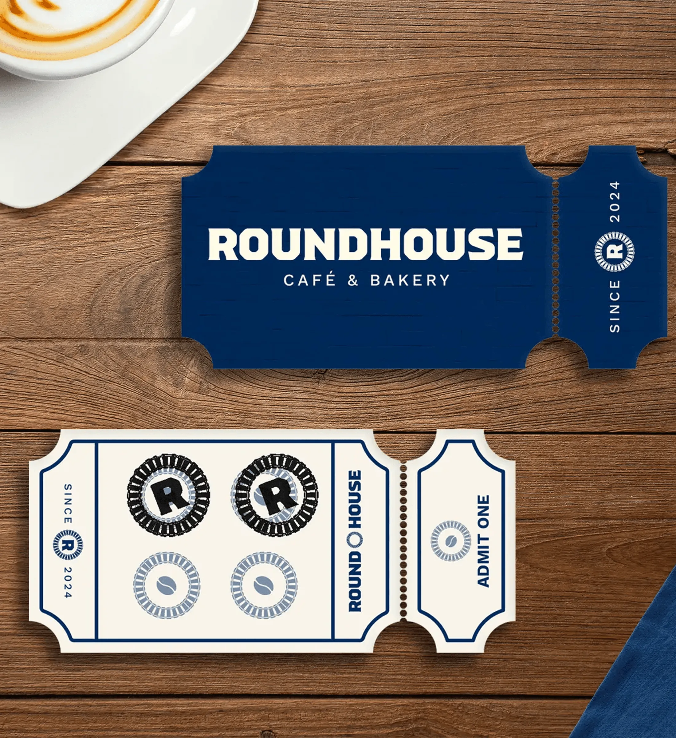
Train-inspired loyalty stamps, branded wraps, and vertical signage reinforce the identity in subtle, memorable ways. These details were crafted to echo the spirit of railway travel - durable, directional, and thoughtfully engineered.
Website
Carrying the brand online.
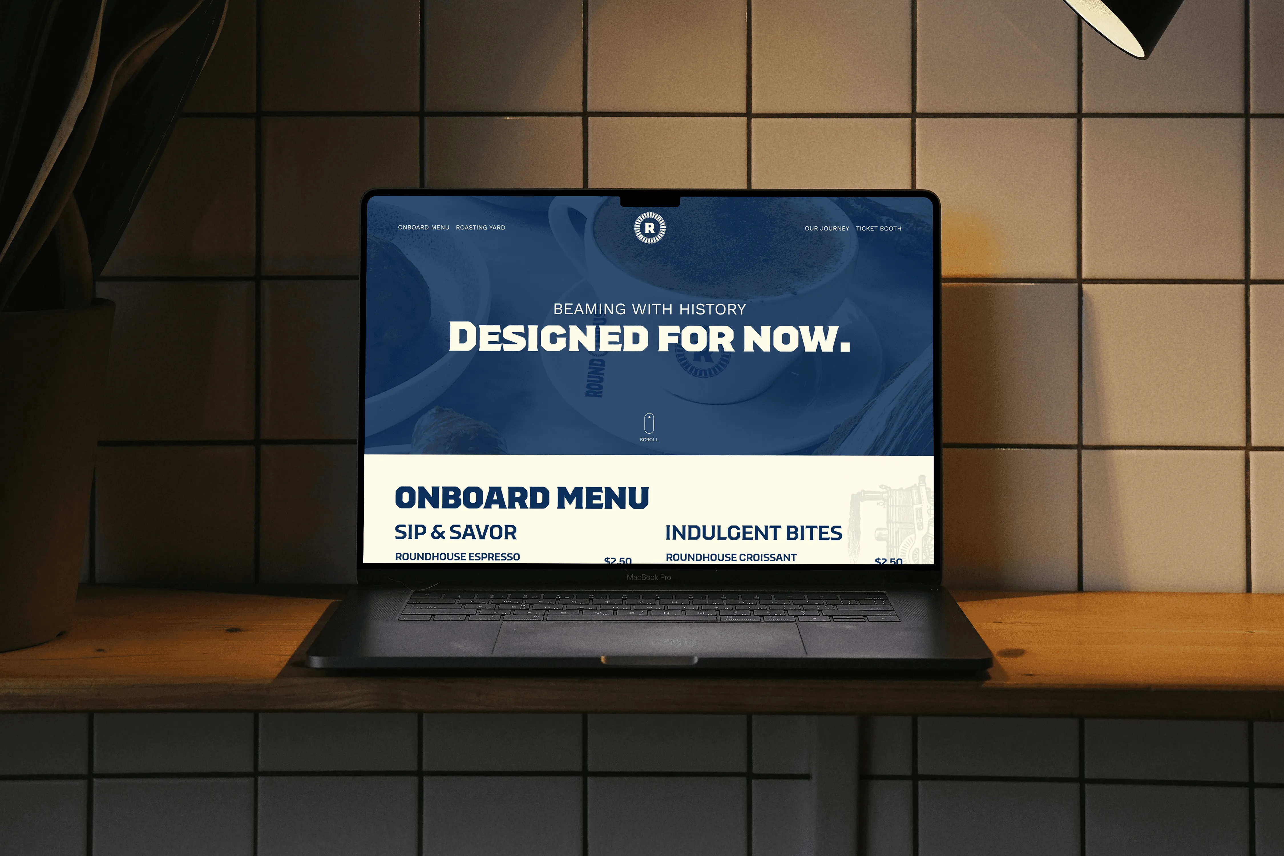
The brand’s bold typography and structured layouts translated seamlessly to the web. I built a clean, responsive UI that reflects the brand’s industrial roots while keeping the experience smooth and modern.